About this project
This is a 5 weeks graphic design project, the brief is designing a GPS interface for a brand we chose, while studying the graphic design skills, lofi interface testing and animation skills.
Workshop of graphic design
At the first week of this project we had graphic workshop with Christian Altmann from Propeller Design AB in Stockholm.
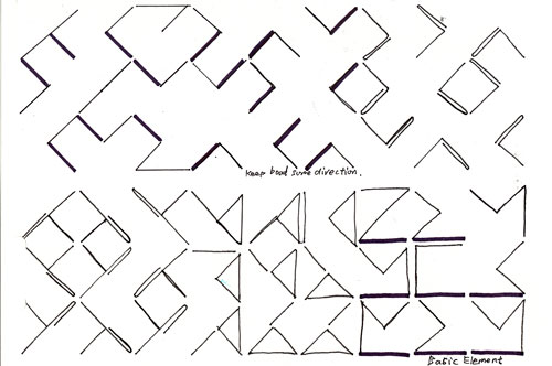
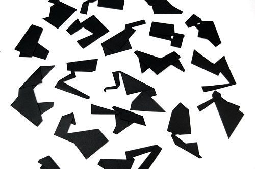
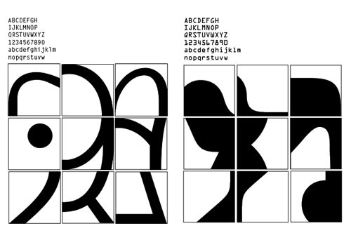
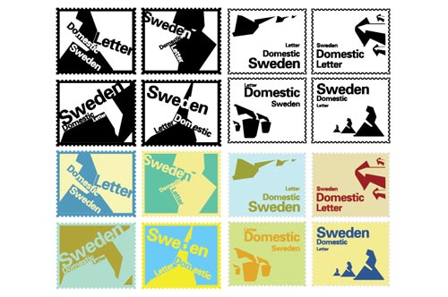
We were being trained to get the sense of graphic elements, in order to apply these knowledge into logo, icon, typeface design later on. We did basic practice such as matrix, creating graphic element by folding papers, identifying typeface and stamp design.


User Testing
Before we start working on our own GPS, we spent a week to do research of exist GPS in groups. I teamed up with Maggie and Linda, we were using a Nokia GPS device on our way home, trying to understand how is it working and the problem of interface navigation and comunication.
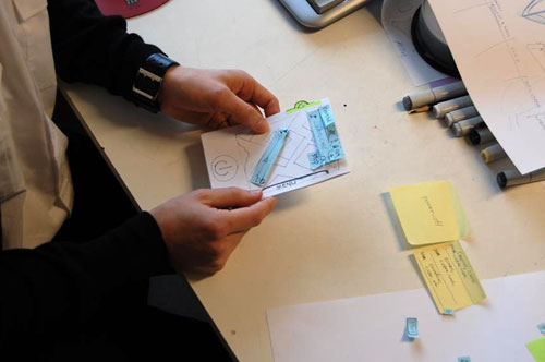
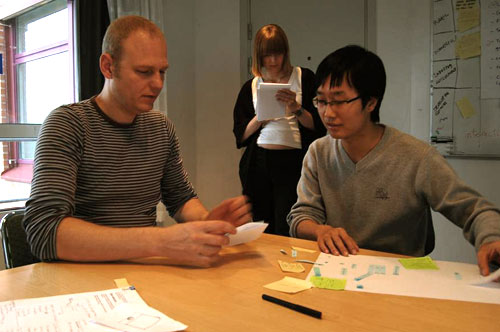
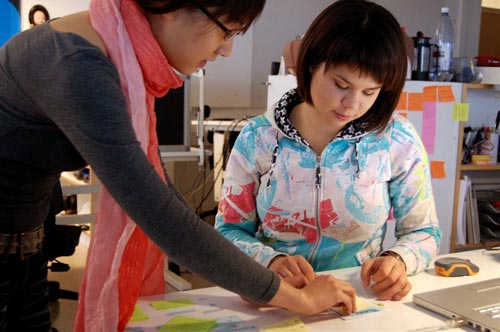
After a couple of days, we started brainstorming a simple interface navigation solutioin, and we made a paper prototype by sketching on the post-it notes as the elements of the interface.
When we were testing our prototype, each of us has different jobs, one will talking to the user, another one will observing and writing down the notes, and the last one will taking photos. We interviewed 3 people and we switched our jobs everytime.


Design for National Geographic
I chose National Geographic as my virtual client, what I want to do is identifying this brand, designing a GPS interface as a Naitional Geographic products, and visualizing my approach to my listeners in the presentation.
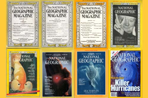
I did the research based on their website, and I also spent a lot of time on their magzines from 1913 to 2006 which is very interesting for me. By looking the history of this brand and compare it to today, I got a lots insights of their graphic style.
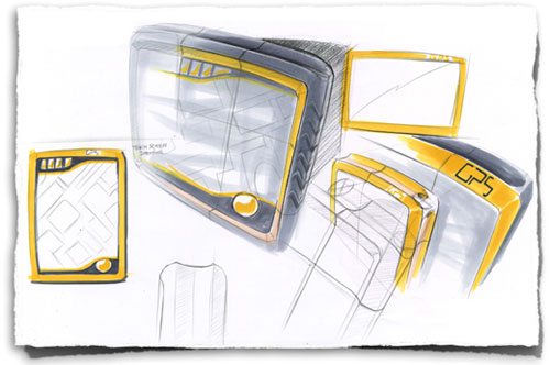
Sketches
Here is my sketches showing the very beginning design process. I was trying to visualize the ideas in my mind, the logo, icons, interfaces, product shape and size, I made a full scale model by using cardboards, so I can get a direct feeling of the dimension of the icons and other graphic elements.
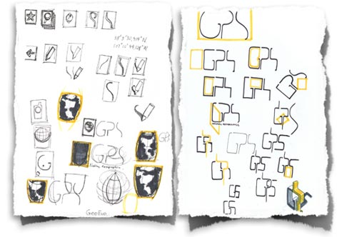
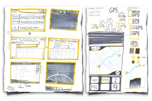


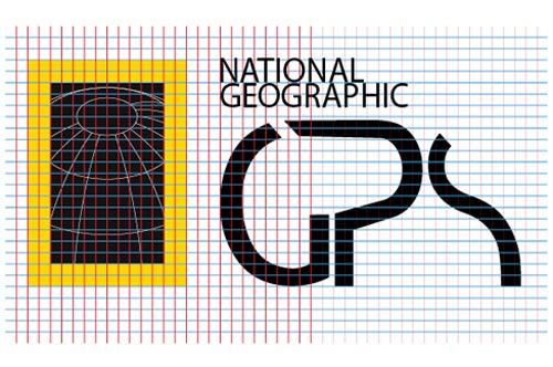
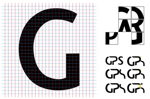
Logo Design
By applying the knowledge I got from the graphic workshop before, I felt more comfortable working into the details. most of the time I worked in this grids to modify the details of typeface, I tried to put the feeling of the brand into the logo, but also want make it looks stand out.

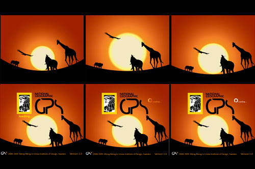


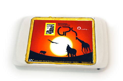
Final result
Here is the final animation. In this project, I feel National Geographic is a typical and classic America brand,long history and strong influence. Meanwhile, iphone is in the same way. That is why I used iphone as the device in this animation. Made in After Effects.